The Problem
In order to keep our teachers happy and to encourage them to keep students taking lessons through TakeLessons, we needed to provide teachers with more robust and modern tools for managing their clients, their schedule, and their earnings.
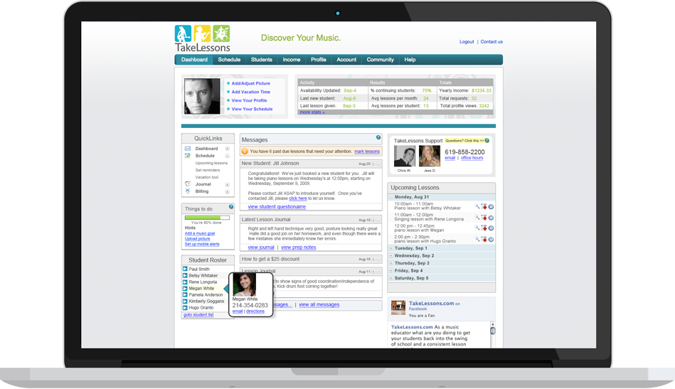
The accounts that teachers had when I started were cluttered, outdated, and frankly hideous.
The Process
I conducted extensive research via telephone and in-person interviews with our existing teachers to learn not only what features of the TakeLessons account did they use and not use, but also how they manage their business with clients they teach outside of TakeLessons.
This research allowed us to focus our efforts and prioritize features for the revamped accounts. It also identified the need for the accounts to be mobile optimized because teachers frequently needed to access client information or reschedule/cancel lessons while on the go.
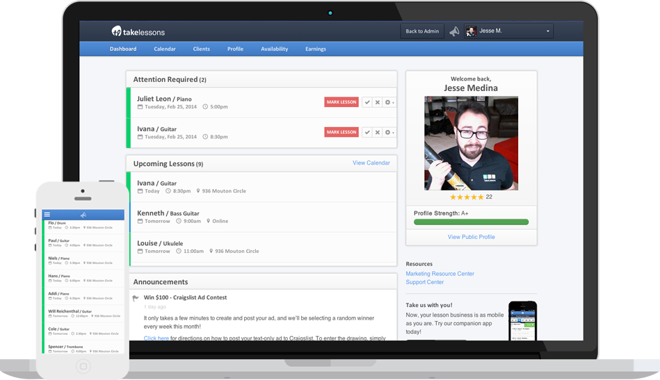
After defining the information architecture for the new accounts, I followed a mobile-first approach, sketching out and prototyping the entire teacher account for mobile (testing with teachers and iterating along the way). I then worked closely with my visual designer to direct and iterate on visual comps of the desktop layout. When we got to development, I worked closely with the product manager on the prioritization and strategy for development of new features over multiple iterations so that launch went as smoothly as possible.
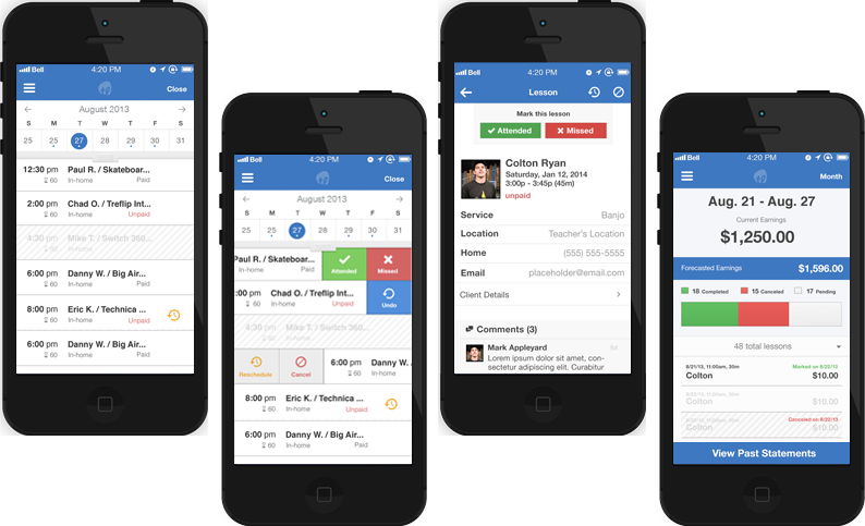
In addition to the fully responsive accounts, I also defined the information architecture and designed all of the interactions for a more focused companion iPhone app. This allowed teachers to quickly see upcoming lessons, find a student's contact info, and check on their current and forecasted earnings. The teacher could also swipe an event left or right to mark attendance, reschedule, or cancel the lesson
The Outcome
After we launched the new accounts, we listened closely for feedback from our teachers both by reaching out directly and by shadowing our teacher support team on the phones. As with any big refresh, there were some teachers resistant to change, but the vast majority loved the cleaner layout and the Dashboard more focused on the tasks they needed to accomplish.
The only request we had for an update to the app was to make an Android version!
Check it out on the App StoreThat being said, there were a couple of misses at launch:
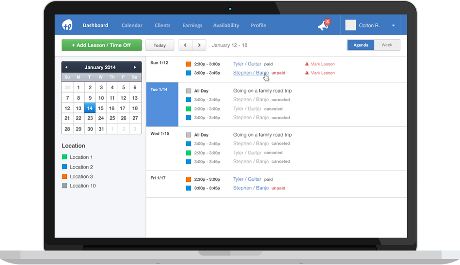
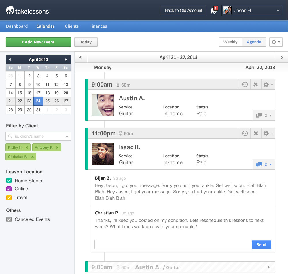
- The Calendar was originally scoped to have both an Agenda view and a Week view, but the Week view was pushed back due to development constraints. The teachers HATED the new calendar. This was one place where they didn't want big events with large pictures and text, they wanted information! I quickly mocked up and tested a more streamlined Agenda view and it was launched the following iteration (to the delight of our teachers).
- We had removed the ability to reschedule all lessons when rescheduling a calendar event. This was on the list for future iterations, but we hadn't understood when prioritizing how frequently this functionality was used. This was reprioritized to be launched the following iteration as well.