The Problem
The business model for TakeLessons is that the company takes a percentage of the money a student pays and passes the remaining amout on to the teacher as lessons are taught.
In order to maximize revenue, it was imperative that we address the key workflow of searching for, selecting, and ultimately booking lessons with an instructor. The existing checkout funnel had several seemingly unnecessary steps that we wanted to revisit and the design just generally looked very dated compared with the more updated home page.
Strategically, we also needed to maximize the number of students choosing to book online rather than calling into our sales team. It wasn't scalable to keep hiring more sales personnel as the traffic and sales grew.


The Process
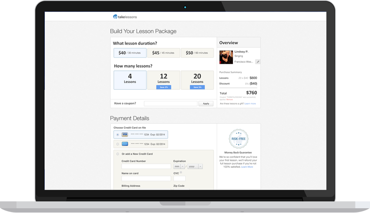
I did extensive research shadowing our sales team on the phones to discover not only what the blockers were for completing a purchase online, but also how the sales team was walking the customer through the different decisions they had to make. Once they chose a teacher, the student also had to decide on the lesson location, the lesson length, and the number of lessons to purchase. Two things became clear during this shadowing:
- Decisions about lesson length and quantity are almost always made at the same time to arrive at an acceptable total dollar amount for the transaction.
- Around 50% of the people calling in were not ready to commit to a specific day and time or to sign up for recurring lessons.
I sketched out and prototyped a new checkout funnel that more dynamically tied the decisions about length and quantity together, having the user construct their "Lesson Package". The new funnel also placed the schedule selection step as an optional step after the student has purchased lessons. This updated funnel was tested with participants on UserTesting.com and then, after implementation, as an A/B test with the existing checkout funnel.
Try it for yourself!

The Outcome
During the A/B test it quickly became clear that by continuing to test the existing flow alongside the new flow we were leaving money on the table. The new flow nearly doubled online conversion for both sales and leads and increased the percentage of sales completed online by ~50%. It did this by removing obstacles and better organizing the choices the user had to make.